The Colour of 2018
by Ryan Drayne
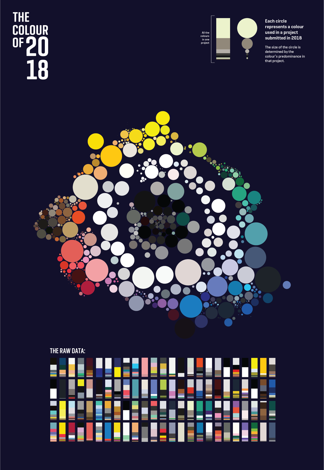
The Colour of 2018 is a visual representation of all of the colours used in projects from the 2018 100 Archive.
Colour choice is important. Colours can change the mood and how a subject is perceived. Designers choose colours carefully. From research, it is striking to note the frequency of bright, pop-y colours in some years in the 100 Archive and the use of pastel and dark colours in others.
Images from each project were run through a colour extraction app. This gave me a visual representation of what colours were used and how much in each project. This can be seen in the ‘raw data’ section which on its own was too difficult to read.
Circles were used to represent each colour and then placed in a layout inspired by Itten’s colour wheel. All the blacks, greys and whites were placed in the centre, so it was easy to tell if a particular colour had been popular that year.