The Rise of Interactivity in Design 2010-2018
by Timmy O’Sullivan
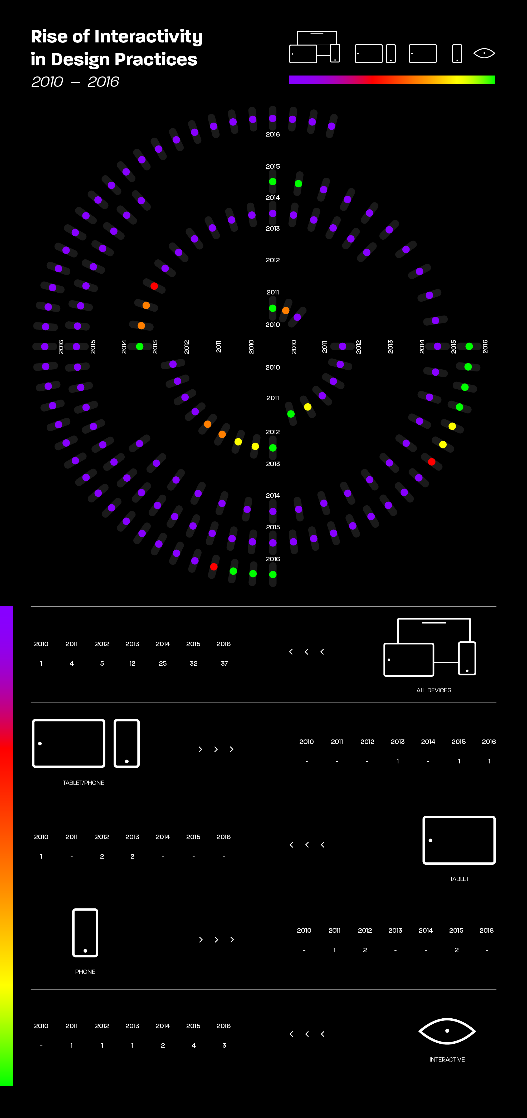
This data visualisation looks at the rise of interactive design projects entered into the 100 Archive from 2010 up until 2016. All data was collected through the 100 Archive data tool.
Once the data was collected, attention was paid to each of these individual projects and collected data on what devices these projects were formatted for; phone, tablet, computer etc. The visual approach is contemporary yet futuristic in style, the colours chosen are technology inspired and the overall look resembles a circuit board. The bright RGB coloured gradients and assets bounce from the dark background giving an easier read for the viewers.