100 x LSAD

Every year at Limerick School of Art and Design, the fourth year Graphic Design Communication students undertake a module in information design, where they are tasked with finding new and interesting ways of graphically representing information. This year they took the 100 Archive as their starting point and rigorously researched the who, what, when, where and why of design in Ireland in order to create a suite of data visualisations to support Map Irish Design.

Projects spanned deep dives into design in certain sectors such as the charitable sector and healthcare, publishing and the alcohol industry. Students explored specialist areas in design from interactive design and type design to environmental graphic design, and they questioned the future of print. They interrogated formal qualities in 100 Archive submitted projects such as type choice and use of colour, and they dissected the industry in terms of skills, working hours, pay and gender representation. Three proposals for interactive projects poke fun at rivalries in the sector, how design studios are named, and what makes a successful 100 Archive submission.

The brief was led by Year Four Tutor and regular 100 Archive collaborator Eamon Spelman, with visits and tutorials from Map Irish Design’s identity designer Keelin Coyle and 100 Archive’s Aideen McCole. Below is a selection of 18 projects completed by the students.

100 ARCHIVE CHEAT SHEET™


By Farouk Alao

The ​100 ARCHIVE CHEAT SHEET™​ is a tool proposed to help designers be successful in the archive and should be taken with a grain of salt or two!

When looking through the archive I noticed that certain types of projects are more likely to be successful than others. The success could depend on colour, typefaces, use of images etc. Following these observations, ​100 ARCHIVE CHEAT SHEET™​ was developed to help designers better their chances.

The ​100 ARCHIVE CHEAT SHEET™​ will allow the potential entrants to select the client context and mediums that their project fits into, they will then be prompted to upload visuals from their submission which will be analysed to extract visual data such as colour, typefaces, images etc. All of this data will then be used to determine the likelihood of the project being successful in the archive. The visual approach of the ​100 ARCHIVE CHEAT SHEET™​is influenced by old school dos and terminal screens combined with layouts that some designers might be familiar with.

A special feature of the ​100 ARCHIVE CHEAT SHEET™ is that it will advise on what conceptual or visual elements will increase the odds of a project being featured in the archive but at the end of the day it’s for a laugh and shouldn’t be taken too seriously.

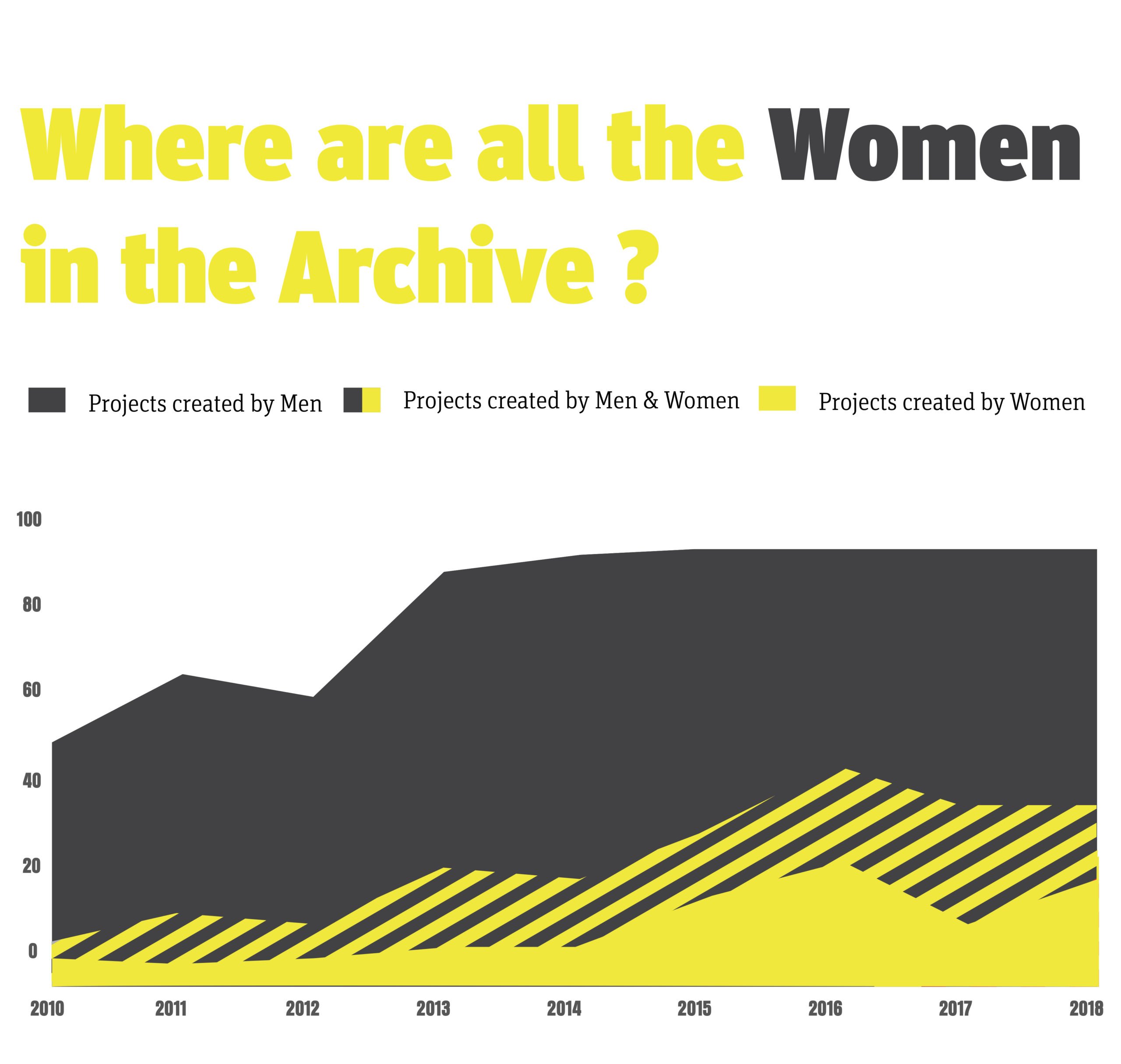
Where are all the Women in Graphic Design?

by Catherine Butler

As a woman in graphic design I was interested to see how we were represented within the graphic design community.

I started looking within the 100 Archive selection to see does it represent the 59.5% male 40.4% female membership. It did not, with men’s work being selected more. Why is this? When 70% of graphic design students are women, how come only 40% move onto working in the field. With less again actually having leadership rolls, only 11%.

This data visualisation is to raise awareness to the gender gap in design, something that needs to change.

Visualizing this idea, I wanted to stay away from the stereotypical gender signs and colour. Sticking to a simple graph with a strong block of grey to show the male dominance within design.

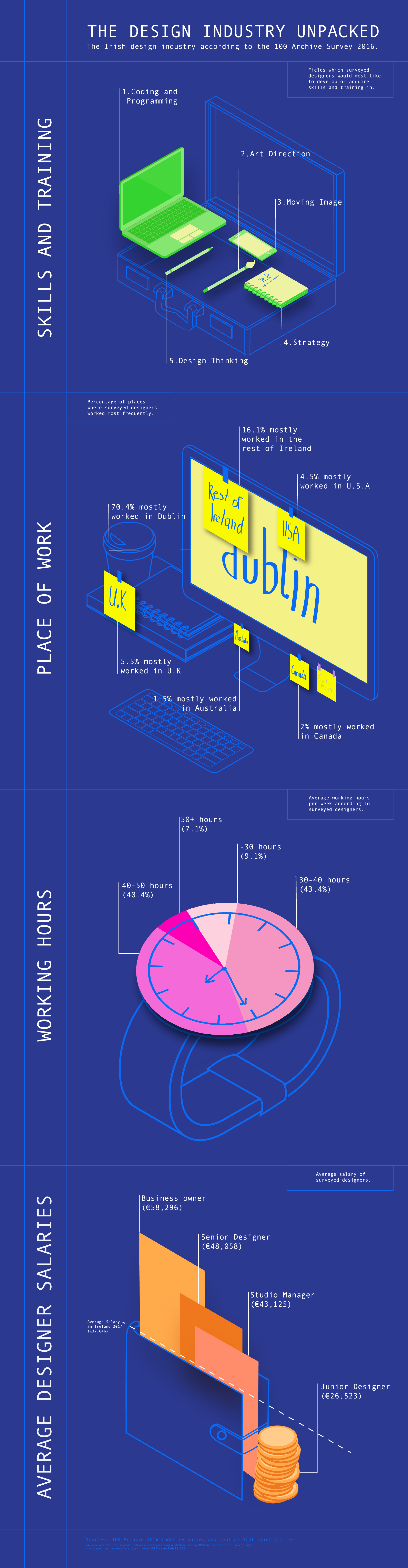
The Design Industry Unpacked

by Claire Dillon

As a student about to make the transition from young, naïve grasshopper to fully-fledged designer, it’s important to learn about the industry I’ll (hopefully) work in. My infographic explores some of the most important aspects of the design industry in the eyes of the humble student: what skills you need, where people work, how long is the average working week and are you likely to be broke by the end of it.

My infographic unpacks statistics from the 100 Archive 2016 Survey and lays it all out there. I chose to draw inspiration from blueprints and isometric layouts and illustrate my information in the form of a designer’s everyday objects, an abundance of sticky notes included.

Studio Name Generator


By Áine O’Neill

This proposal for an interactive piece is a playful response to the different studio names found on the 100 Archive.

After research, patterns began to emerge and different genres were established, such as obscure design references, family members, positivity, words relating to the brain, space references, colours and numbers. From there, the ‘Studio Name Generator’ was created and developed around a set of questions based on studio names. These questions and answers were then presented in a quiz format.

The visual approach was influenced by 80s arcade games and carnivals, to encourage the user to playfully interact with the piece.

It’s a tongue-in-cheek take on the fact that as designers, we feel we are original and different, but collectively we often look to similar sources of inspiration.

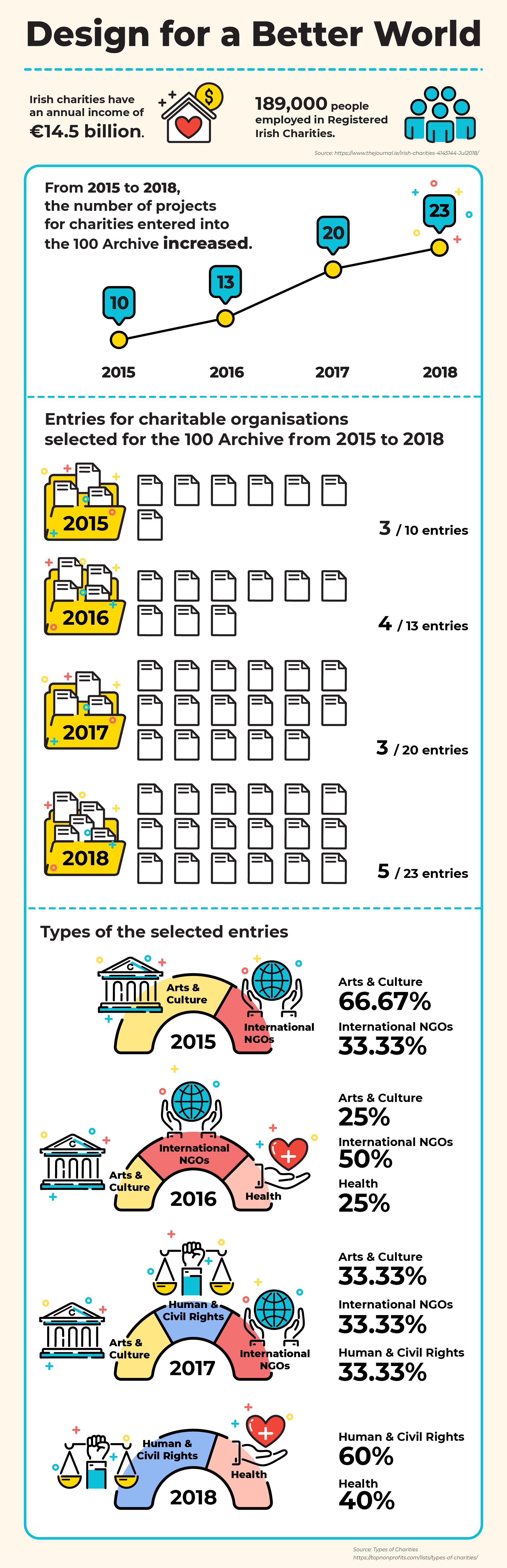
Design for a Better World

by Wei Xing Hoo

From the 100 Archive, it is clear that the Irish design industry has strong links with Irish non-profits and charities.

The data shows an increase in design projects occurring in the charity sector, suggesting that designers are designing a better society.

According to the report by Indecon International Economic Consultants, commissioned by The Charities Regulator, Irish charities have an annual income of €14.5 billion, they employ 189,000 people and they benefit from the voluntary work of over 50,000 board members/directors and the work of over half a million operational volunteers. There are almost 10,000 registered charities and a further 20,000+ organisations in Ireland’s wider non-profit sector.

Charities in Ireland play a vital role in society – they make a difference to millions of lives here and across the world.

This data visualisation shows the number of charity-based projects entered into the 100 Archive increased from 2015 to 2018. The entries for charitable organisations making the 100 Archive selection also increased at the same time.

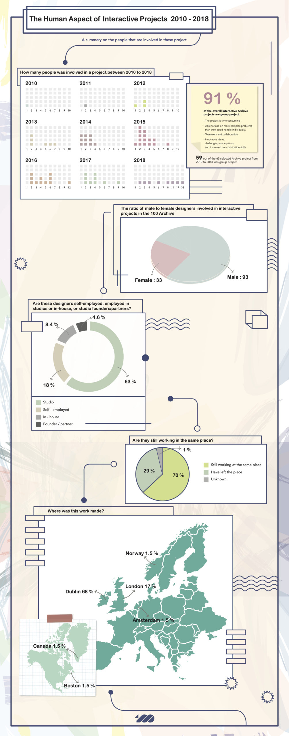
The Human Aspect of Interactive Projects 2010 – 2018

by May Hooi

Interactive design is an important component within the giant umbrella of user experience (UX) design and more and more designers are now working in that area. Many UX projects give designers the opportunity to collaborate together and work in teams. Based on the data collected, I decided to focus on the human or collaborative aspects of the UX projects featured in the 100 Archive.

Interactive projects have slowly taken off since 2010 when only one project was selected and in 2015 it reaches its highest record with 15 selected archive projects. The visual approach to the project attempts to mimic the look of a project development board. By doing this, it gives a sense of interactivity to the entire piece. It’s the human aspect of any project that helps to bring a project to life!

Is Print Really Dying?

by Goh Ee Lee

Everyone knows digital media has exploded and print circulation is in decline. The controversy concerning the future of print media is ongoing. With the rise of the internet, many anticipated print would tumble, with many suggesting print media was no longer needed. But can we really dismiss print media as completely obsolete?

The data visualisation shows both print and interactive projects which had been selected by the 100 Archive from 2013 to 2018. It also explores the investment of Irish media in digital solutions, the growth of the internet user in 2019, and the expected revenue of designers in the 100 Archive in 2016.

Therefore, despite the fact that many companies are now spending less on print, it is still an important component of the communications environment among European audiences. Digital may be growing, but print will always be there.

Hot or Not


By Arlene Ellis

There is often an unspoken rivalry between design studios and this is a way of looking at which studios are ‘hot’ and what are ‘not’. With this proposal for an interactive piece I am looking to explore this in a lighthearted way, by looking at Dublin studios on the 100 Archive and how many projects have been submitted and accepted by each studio.

When certain locations are hovered over on-screen, information will pop up which includes address, how many entries to the archive and how successful they were. It gives the viewer an idea of where the most popular locations in Dublin are for design studios and how successful they are.

The visual approach is quite humorous and light-hearted and not intended to cause controversy but to simply poke fun. The title “Hot or Not” is inspired by the pastel colour palette of pink, blue and red and references the film Mean Girls and certain celebrities like Paris Hilton.

The Rise of Interactivity in Design 2010-2018

by Timmy O’Sullivan

This data visualisation looks at the rise of interactive design projects entered into the 100 Archive from 2010 up until 2016. All data was collected through the 100 Archive data tool.

Once the data was collected, attention was paid to each of these individual projects and collected data on what devices these projects were formatted for; phone, tablet, computer etc. The visual approach is contemporary yet futuristic in style, the colours chosen are technology inspired and the overall look resembles a circuit board. The bright RGB coloured gradients and assets bounce from the dark background giving an easier read for the viewers.    

The Colour of 2018

by Ryan Drayne

The Colour of 2018 is a visual representation of all of the colours used in projects from the 2018 100 Archive.

Colour choice is important. Colours can change the mood and how a subject is perceived. Designers choose colours carefully. From research, it is striking to note the frequency of bright, pop-y colours in some years in the 100 Archive and the use of pastel and dark colours in others.

Images from each project were run through a colour extraction app. This gave me a visual representation of what colours were used and how much in each project. This can be seen in the ‘raw data’ section which on its own was too difficult to read.

Circles were used to represent each colour and then placed in a layout inspired by Itten’s colour wheel. All the blacks, greys and whites were placed in the centre, so it was easy to tell if a particular colour had been popular that year.

Spaces & Places

by Robyn Sproule

It is clear from the data supplied on the 100 Archive that environmental graphic design (EGD) is a growing field. The data visualisation illustrates this growth throughout the years and identifies the number of environmental projects that are interior, exterior or both.

Graphic design is all around us. Environmental graphic design creates an experience, influencing how one feels when walking into a building or room. The power that environmental graphic design has is fascinating and, therefore, inspired me to gather and visually represent the growth in this sector.

The final design, which contains layered isometric planes that resemble floors of a building, represents each year that EGD projects were submitted. The design aesthetic is similar to a blueprint, used in architecture, which highlights the subject matter and creates a unique visual approach.

Health projects from the 100 Archive 2010-2018

by Megan O’Neill

The data visualisation looks into health-related projects from 2010-2018 and includes the entries that were both submitted and archived.

It is interesting to note the rise in health-related projects in recent years. Could this show that Irish health services and health-related companies recognise the need for good design?

Work Hard Play Hard

by Janae Quek

According to the design work submitted to the 100 Archive, the packaging of alcoholic drinks has been increasing from 2012 to 2018. At the same time, the Gross Domestic Product (GDP) in Ireland is increasing too. As GDP provides an economic snapshot of a country, used to estimate the size of an economy and growth rate, it suggests that while we are working more, we are playing more too…

Who Shot the Serif?

by Jade Stone

The data selected grew from an interest in comparing the use of serif and sans serif typefaces after reading a design article predicting a rise in the use of serif typefaces in 2019. I took the opportunity to use the 100 Archive to make my own analysis.

Who Shot the Serif? is an investigation into the use of serif versus sans serif typefaces in Irish design using archived projects from 2010 to 2018 as a basis. The most prevalent typeface in each project is included and displayed according to its form and weight.

The findings show that sans serif still dominates, but the detractors are starting to stand out. This is highlighted by creating an abstract display of the data. Each line represents one project. The ones who used a serif typeface are distinguished by their orange colour and horizontal to signify the slab of serif typefaces. The projects using a sans serif typeface are in white to allow the serifs to stand out.

The Rise of Editorial Design and the Decrease of Irish Book Sales


by Gaelyn Donoghue

It appears that we are living in a generation of visual learners. Based on statistics, 65 per cent of the population are visual learners, and it seems to be growing in numbers each year. Based on the 100 Archive data tool, it is apparent that there has been an increase in the production of editorial designs such as magazines, zines and journals from the years 2010 to 2015. Interestingly, there seems to be a direct correlation between the rise of editorial design and the decreasing amount of book sales in Ireland during the same timeframe. It is apparent that as we grow as a country and world as visual learners, that the market for reading will decrease over time and instead be replaced with editorial designs, increasing our need for designers and artists. This gives us a chance to grow in the market of editorial design and to look at this change as an opportunity for collaboration between writers and designers in the future.

Gender Breakdown


by Áine Lenihan

I chose to look at the disparity between males and females in the Irish design industry. Data was gathered from 10 small to medium design studios located around Dublin with no more than 15 designers, chosen at random. This allowed me to analyse the role of each designer within the studio and the difference in the number of male and female creatives and to see who held leadership positions or founded these companies. 

Upon gathering the data, it was noted that on average there was always one more male in the studio and no studio, gathered in my data, was founded by a female. This can be compared to the data on the number of females studying graphic design in comparison to the amount represented in the design industry. The ratio of women to men in design education is 70:30, in comparison to the ratio of 40:60 in the design industry. 

The visual approach was to be quite different and move away from tradition. I chose to visualise the graph in the abstract by creating intertwining, colourful shapes representing different pieces of data. This approach complemented the information collected because there was an overlap in the data found. 

100 Archive Type Specimen


by Isabel Staunton

The 100 Archive records, identifies, and illustrates the landscape of Irish design. 

This infographic is a visualisation of typography design in Ireland, and its representation in the 100 Archive. Ireland’s design culture is growing exponentially. The data visualisation explores the significance of type design within that culture. The data represented in this piece was taken from the 100 Archive Selections between 2010 and 2018.